


Let’s talk good design…
 Yahoo.com
 Yahoo.com
This. Is. Us. Three words that get us excited, a little scared, and grabbing a box of tissues whenever we see them. I have to admit. I am turning on my television every Tuesday at 9pm to see what the Pearson gang is up to. There’s laughter, there’s drama, there’s romance and luckily for us, there’s these guys:
People.com
 People.com
The show has been getting a lot of press recently, due to its beautiful cast members and talented writers, but one thing that we need to talk about is…
The Set Design:
ArchitecturalDigest.com
 ArchitecturalDigest.com
The set designers did a wonderful job of mixing Randall’s conservative style with Beth’s spunky and eclectic edge. When my team and I saw the set design we were tickled pink. First and foremost, because a lot of the pieces the set stylist chose are pieces that we use at TYS all the time!
The chandelier, the rug, the floor lamps, the baskets, the sofa, the art, the drapes, the console, etc.
*Click on the bold links above to see how we used them! *
These are all quintessential items for Tweaking. But what really had me going was the down-right GOOD DESIGN. I am going to point out a few things the set designers did that made this space work!
-
Scale
One of the most, if not the most, important aspects of home design is SCALE! Recognizing the scale of items will help you create a more balanced look. Here, the designers paid attention to scale. They wanted the audience’s eye to see the decor in a way that is entertaining yet not distracting. Note the strategic placement of big and small items. They send your eyes up and down the room. Everything hits at the perfect height, adding dimension and depth to the space.
-
Circulation of Color
See those chairs in the left corner? That’s what my team would call a color bullseye. WITHOUT those curtains distributing that reddish-orange color around the room, the eye would go right to that reddish corner, which is a NO – NO. However, here, that tinge of color was sent around the room by use of the floral curtains. Shades of gray and blue are appropriately distributed and cleverly incorporated into certain spots of the room (note the throw blankets). Soon we will be releasing an article about Different Ways to Use a Throw Blanket, and this is one of them! Also, break up solid colors with colored prints and patterns. Lastly, they brought in GREEN!!! The organic element is introduced to lessen the harshness of the primary color palette. Notice how the green color is distributed throughout the room at different heights (the standing plant in the left corner, the shorter plant on the nesting table, and the green in the painting above the fireplace). Those browner, more organic elements are also sprinkled through: (fireplace, wicker baskets, coffee table and then UP to the chandelier.) Pure genius!
-
Placement
Balance, balance, balance. I can’t say it enough. If you want to achieve tranquility in any space, it needs to feel balanced. And that’s when placement comes in. Let’s start with the back of the room. Notice how the console table stands directly in between two symmetrical floor lamps and then a statement piece is brought into the middle to balance out that space in between the back windows. The coffee table used is the exact length of the end of the sofa and then the space is squared off even more with the introduction of two floor pillows that take up the same amount of space width-wise.
*KEY TAKEAWAY* = Use items that you love. You like those curtains? Who cares if they are a bold print. Get them! Use them! Don’t worry about things matching. Pick out things that make you happy. Then, once all the selections are finished, and you love them all, it just takes a little elbow grease and creativity to make them work together! Just remember to be aware of scale and color and trust me- the placement will come to you naturally! Do what feels good.
And now…
Our Rendition of Randall + Beth Pearson’s
Living Room
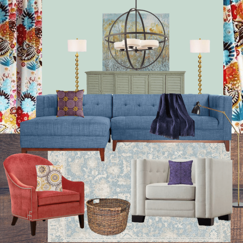
We decided to have fun with this design!
We thought it would be a good idea to incorporate a 70’s midcentury vibe, to pay homage to the series’ Sonny + Cher days.
Click on our selections below
to go shopping!


Our pick for paint?

Try Sherwin Williams SW6206 – Oyster Bay
*Bonus*:
If you are making any purchases at Houzz.com, use promo code
947A3
It’ll get you 5% off your purchase! *

"12 Tips to Tweak Your Way to a Happy Space”